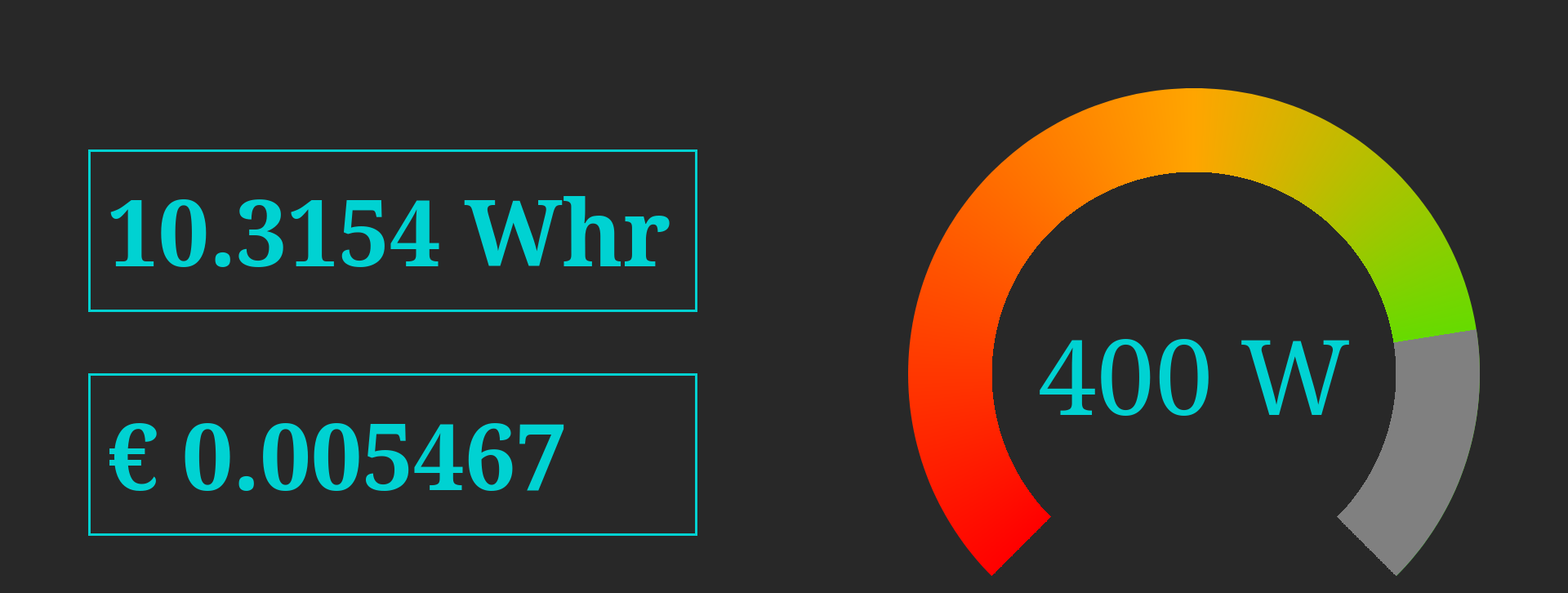
The other day I was helping my brother with the second version of his performance installation DEMARRAGE, which involves serving a web page from an ESP32 that displays the energy produced by two dynamo bikes.
For this page we wanted a simple gauge, so I figured a solution would be an internet search away. But all the examples I found seemed really complicated, with verbose markup, opaque CSS, and sometimes an entire JS library. So I decidede to make my own.
My goals were
- Very minimal HTML without any extra dummy elements.
- CSS that is easy to understand and modify.
- Easy to update the value from JS.
- A gauge of 270° rather than a semi-circle.
- (browser compat was not a goal)
The HTML is as simple as it gets, just a div with custom properties and the textual value.
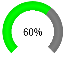
<div class="gauge" style="--value:0.3; font-size:2rem;">30%</div>
Conceptually, the CSS isn’t very complicated either.
- set the size of the gauge
div - set a
border-radiusto make a circle - draw a
conic-gradiantto make a pie-chart - draw a
radial-gradientto cut out the center - center the text with
text-alignandline-height
The code CSS makes use of calc and var, primarily to adjust the conic-gradient angle based on a custom property, but also to parameterize the dimensions of the gauge. This means you can override --size and friends to style the gauge without changing hardcoded values.
.gauge {
  --size: 200px;
  --cutout: 50%;
  --color: red;
  --background: white;
  width:var(--size);
  height:var(--size);
  border-radius:calc(var(--size) / 2);
  background:
    radial-gradient(
        var(--background) 0 var(--cutout),
        transparent var(--cutout) 100%),
    conic-gradient(from -135deg,
        var(--color) calc(270deg*var(--value)),
        grey calc(270deg*var(--value)) 270deg,
        transparent 270deg);
  text-align: center;
  line-height: var(--size);
}
The JavaScript for changing the gauge value is pretty simple too, given some gauge DOM element el you can change the gauge value and text content by simply doing
el.style.setProperty("--value", 0.8)
el.innerHTML = "80%"
Below is a codepen to play with the code. I hope it’s useful to someone.
See the Pen Pure CSS gauge by Pepijn de Vos (@pepijndevos) on CodePen.
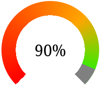
After a bit of chatting on the Recurse Center Zulip, I came up with the following alternative gradients that provide a 3D effect or that goes from red to orange to green. The 3D one works by adding a transparent black gradient to the radial part. The colourful one works by making a fixed backdrop and a transparent-grey gradient on top that reveals the underlying one.
  background:
    conic-gradient(from -135deg,
      transparent 270deg,
      white 270deg),
    radial-gradient(
      var(--background) 0 var(--cutout),
      #0002 calc(var(--cutout)),
      #0000 calc(var(--cutout) + 15px),
      #0002 calc(var(--cutout) + 30px),
      #0000 calc(var(--cutout) + 30px) 100%),
    conic-gradient(from -135deg,
      var(--color) calc(270deg*var(--value)),
      grey calc(270deg*var(--value)) 270deg,
      transparent 270deg);

  background:
    radial-gradient(
      var(--background) 0 var(--cutout),
      transparent var(--cutout) 100%),
    conic-gradient(from -135deg,
      transparent calc(270deg*var(--value)),
      grey calc(270deg*var(--value)) 270deg,
      transparent 270deg),
    conic-gradient(from -135deg,
      red 0,
      orange 135deg,
      lime 270deg,
      transparent 270deg);